Works

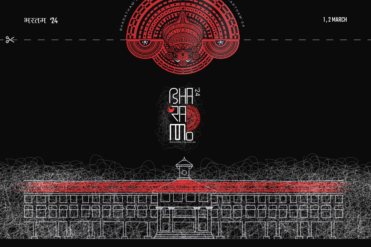
Bharatham - Inter College Fest Website
The design choices, from the professional layout to the cohesive branding, were all made with one goal in mind: to establish credibility. A polished, visually engaging UI is key in building trust with users, ensuring they feel confident about registering, purchasing tickets, or exploring further.

Trip Be Like
The "Trip Be Like" logo is a bold, contemporary representation of the brand, designed to evoke a sense of adventure and excitement. Set against a vibrant orange background, the logo instantly grabs attention, symbolizing energy, creativity, and enthusiasm—qualities that resonate with travel and exploration.

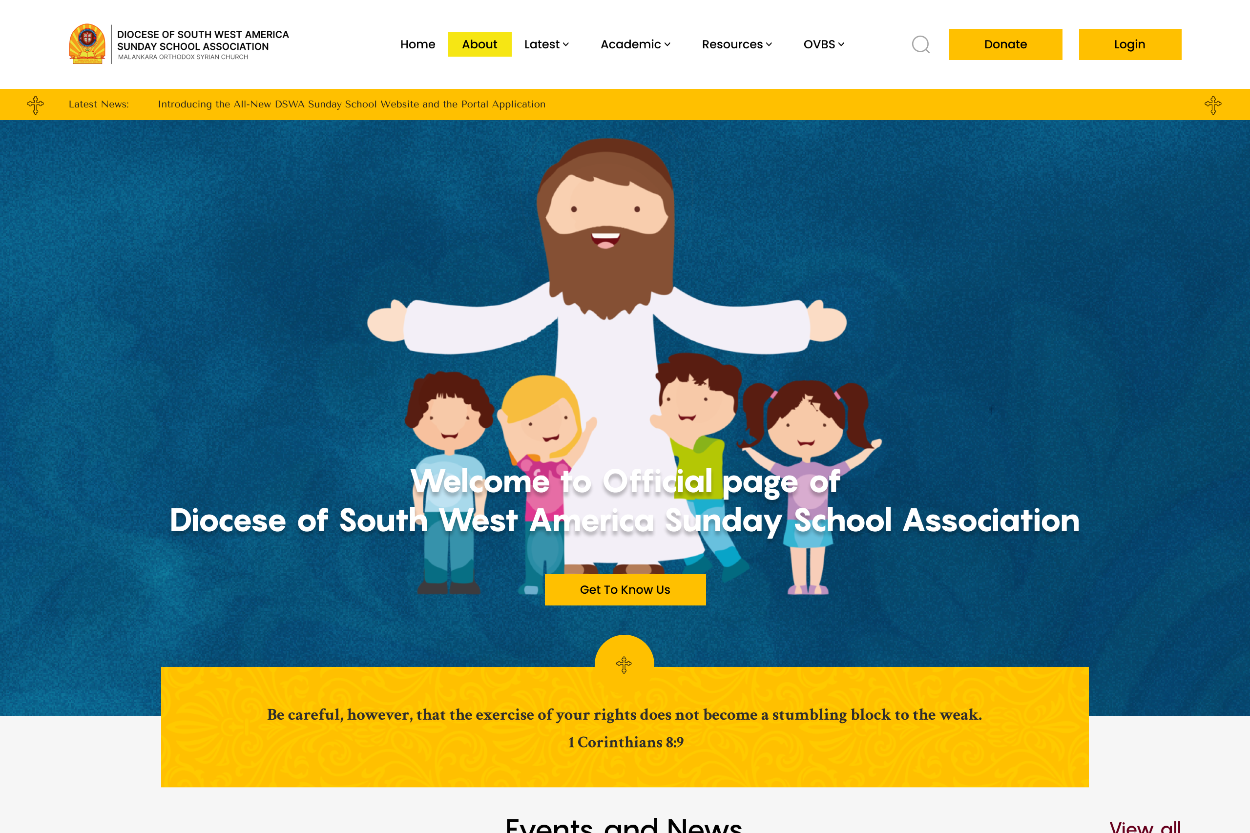
DSWA
The Diocese of South-West America's Sunday School website serves as a digital platform offering resources and online programs for children to learn about Orthodox Christian faith. It features online Sunday School, teacher training, and various academic tools.

Care Dental Clinic
This dental clinic website highlights a range of services including cosmetic, orthodontic, and general dentistry. It emphasizes patient care, modern equipment, and expert treatments tailored to individual needs.


